Monday 12 December 2011

Ethereal mono conversions

I know we have a post with mono conversions in it already, but that was to do with using the split toning module to give a touch of warmth to our images.

This is about making the images a little different in the mono conversion.

Have you seen some of the ethereal looking conversions out there? Some of the really bright striking images? So have I! I also wanted to learn how to do them in just lightroom without having to go into PS and run an action, so I played with LR and came up with a bit of something which does what I want relatively quickly.

Just as a demonstration, and please don't laugh as your images are very likely to be better than mine, here's a before image of beautiful Becky, a model local to me (and very good she is too). I very much enjoy shooting with her as she's good fun on the shoot and works hard to help get what you wish to achieve.


Note the sliders in the basic panel and how there's no change in exposure (the reason for this will become clear).

A nice enough image, I hope you'll agree, but I wanted to change this around a little and make it something different and the ethereal mono conversion is what I chose.

I used the HSL / Color / B&W panel on the B&W part for the cnversion to mono, but instead of it being a plan desaturation, I shifted the sliders around a little. As you can see from the original, the blue of her jeans and red of her t-shirt would make for relatively dark tones in a straight conversion. That dictated the movement of sliders to make those tones brighter.

Blues and reds were the biggest movements to brighten things up in those darker tones.

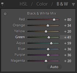
This was the image when that was done, and please note the exposure and brightness sliders are the same; playing with the tones in conversion means that we don't have to globally brighten the image to make it overall brighter and we now don't have massively clipped highlights (there's a tiny difference on recovery between the two; the mono has 10 and the original has 9)


OK, so it's beginning to look pretty bright, but there's no "glow" or ethereal feel yet. It just looks very bright and overexposed (but not clipped). Now comes the adding-glow bit, and it really is simple! It can be done in a couple of ways depending on what your image looks like and how close tot he face you are cropped. In this one, we're not tight in, so we can use a global effect; take the clarity slider and move it all the way to the left. See how it adds almost a glow? Right. Doing this on anything other than a very bright image which you want to add a glow to is very often a nasty effect. I do mean really nasty! On many bright images like this it can be nasty too, so watch what you apply this to! The other way of adding the glow is to press K to get the adjustment brush and set all sliders to 0 apart from clarity which you take all the way left to -100. Set the flow of the brush to about 25 and paint over the areas you want the glow added. Using such a low flow means you can add more of the effect by painting over again. If you want even more control, set the flow lower, but that would negate some of the speed increase you get from doing this in LR.

If you prefer to add all your effect in one go, keep the flow at 100 and apply the whole effect in one stroke. For the brave of heart and those with a little time on their hands to experiment with.

A final image (globally added glow) is below. If you dislike it, please tell me; conversely, if you like it, I'd like to know. If you try this effect effectively on your own images and are proud enough to show them, please link to them in the comments.


HTH someone,
Matt

Tuesday 6 December 2011

Split Toning Panel

Have you ever wondered why the mono prints from some people look just nicer than a plain mono conversion? Why they can have a warm feeling without being obviously toned? I came across this somewhere and have since forgotten where, so here's a thanks to some unknown author who gave me an idea for warming up the shadows which I played with and came out with a nice preset for myself.

It uses the split toning module to give a hint of warmth in the shadows and a hint of coolness in the highlights and it improves things considerably in my mono conversions. You may well have a mono conversion which just works for you every time (and I applaud this), but I like this effect for mine. Obviously, like all presets or PS actions, it doesn't work on every image and requires some tweaking for those it doesn't immediately work on.

Rather than give you a preset, I'll show you what to do to get the effect in your own copy of lightroom and you can save the preset yourself to your own preferred directory.

For testing, I recommend that you have a collection of images or virtual copies of a good variety of image types that you can play with and if they just don't work, you can either hit reset or delete the virtual copy.

Make a mono conversion in whichever way you prefer (I just hit the B&W button on the HSL / Color / B & W panel and used a straight conversion with no adjustments to the sliders for this base image). I've used the image from the previous post for this one as I just love this image in colour and mono!

Here's the image with a plain mono conversion (no adjustment to the colour sliders) for a start image and to allow them to be compared:

Open the Split Toning panel, if it isn't already open and change the highlights Hue slider to about 240 which is a nice blue tone which, when used subtly, gives a hint of coolness to the highlights. That subtlety is by having the highlight slider to a value of only 5. If you have this much higher, it will give a very blue tone and this is meant to be un-noticeable as a tone, but to just nudge the image away from being very plain mono. Once you've done this, take the shadows slider to about 40 which is a nice brown and with subtlety give a touch of warmth to your shadows. Again, we're being subtle, so keep the saturation slider to about 10.

The image with the adjustment made - if you open them both in new tabs and flick between the two, you should see the subtle differences. Barely noticeable, but it gives a much better conversion!


Hope this is of help to someone.

Friday 2 December 2011

Lightroom develop module

Lightroom's develop module is the part of the programme where most of it's users spend the majority of their time. This is very understandable as it's the heart of the raw processing and where most adjustments to images are made.

When you're in the develop module (shortcut d on your keyboard), you have panels on the right (press f8 if it's disappeared) starting with the histogram and the toolbar (crop tool, spot removal, redeye correction, gradient tool and the adjustment brush). Beneath this are the panels proper: Basic, Tone Curve, HSL / Color / B & W, Split Toning, Detail, Lens Corrections, Effects and Camera Calibration.

Out of these, the panels I use most in order are: Basic, Detail, Tone Curve, HSL, Effects, Split Toning, Camera Calibration and lastly Lens Corrections.

That's just my own way of working and if you have a lens which gives you funky distortions that you want some assistance in getting rid of, the Lens Corrections might actually be much more use to you than it is to me. I don't own anything that distorts really badly and if I'm shooting wide, I tend to keep important things away from the edges of my 24-105. This means I really don't have that much use for this module. You may, of course, be totally different. And it's really good to know that there's variety in the world!

I'll make a post or two on the different panels and how I use them; starting with the basic panel which is the one I think most of us should have ready for every image even if we have got everything right about it - something I don't achieve very often!

I'll leave you with an image which required only the tiniest bit of tweaking in the develop module; it got a small adjustment to exposure as I was 2/3 stop out on my exposure. His Mum loves the image and has given me permission to use it for marketing material.


All the best

Monday 28 November 2011

The raw files look flat in the modules when they were vibrant in the import dialogue

I have seen more than a few people asking the question about why their files look lovely and vibrant on the camera screen and in the import dialogue (and as thumbnails in explorer or finder), but when they've been imported to LR, they become dull and flat.

The answer, apart from canon raw files being flatter than those from nikons (canon user here so it's not manufacturer fanboy bias), in my experience (5d2 raws compared to d700 raws) is that all those places show a rendering of the embedded .jpg file in the raw data.

All the raw files that I'm aware of, and if anyone reading this knows different, please correct me by linking to your information, have a jpg rendering of the image embedded within the raw data and this is what the camera screen displays, the OS file managers show and the import dialogue reads for display. Once the images are imported into the catalogue, the raw data is used to build the preview (unless this option has been altered from the default) and to build the image you see on screen when processing your images (if preview building is turned off) and when you zoom to 1:1 in loupe view.

"Loading" as the beautiful Fredau is rendered by LR.
The reason they're different is that your camera will have applied some kind of processing to the data before saving the jpg preview in the raw file. Check your picture styles on the camera for what processing is applied and you can then make yourself a preset to do that kind of thing as a develop preset in LR should you choose.
And I couldn't have a pixellated version of Fredau in this post without posting a proper image of her. She's far too beautiful and talented as a model to ever be left as a pixellated half-render.


HTH someone. Happy shooting and editing.
Matt

Thursday 24 November 2011

When Lightroom tells you that it can't find the file you're trying to work on

Many of us have come across LR telling us that 'The file named "xxxxxxxxxx" is missing or offline'


and the first time it happens is a moment of dread; especially if we're unfamiliar with LR and we think it's eaten one of our precious images. If you do get this message on your screen (the above is a screengrab from the develop module, but loupe view in the library module shows the same), LR has a mechanism for finding the files and getting things back in order for you. Heaqd to grid view in the library by pressing G on your keyboard and make sure you're highlighting the file which is missing. On there, you'll see the following "badge" on the thumbnail highlighted in red:


Clicking on that brings up a dialogue box which asks if you would like to locate it. If you moved the files outside of LR (for example in explorer or the finder if you're running an apple pc) and you know where you moved the file, then just use the dialogue to navigate to where you moved the file. Simple, eh?!

A simple solution to this problem not being a problem, is to only use LR to move your files once they're in the catalogue.

There is another one which can come up for missing files and involves you having moved an entire folder from outside the LR interface. This is much more tricky, much much more tricky. Actually, it isn't. It works in a very similar way.


You get the question mark (above) showing on the folder in your Folders panel and every file in the folder shows the missing file badge. This is solved by right clicking on the offending icon, and it is offensive to know you've been a muppet again and moved a folder outside of the LR interface, and selecting "Find missing folder". You again get a dialogue box up in which you can just navigate to where you moved the folder.


The simple solution to this is the same as for a missing file, just don't move folders around outside of the LR interface once you've imported images from it into your LR catalogue.

The above situation for missing folders can happen if you've upgraded the drives in your computer and moved your "Pictures" folder to one of the new drives, just follow the above instructions for the root folder and all folders will then reappear in your LR folders panel instead of one by one. If you don't see the root folder ("Pictures" on windows PC, I don't own an apple PC, so users of those can identify the root folder themselves, if you've left the standard naming conventions and not moved things about), right click on the highest level folder (or one of them) and select "Add parent folder" to display it. Having the root folder of your images displaying by default can help in other ways for organising/finding your images, but that's beyond what I'm writing about here.

HTH in some way for someone,
Matt

Sunday 20 November 2011

Not about lightroom - abrviewer

This one really isn't about lightroom.


It's about brushes for photoshop or other programmes which use the brushes and shapes from the programme. GIMP is one such and has a huge bonus of being free. PS brushes work directly in GIMP, so don't need converting. Another is PaintShop Pro if you want to convert the brushes in some free (open source) software called abrviewer. This software and technique can also be used to convert brushes made in a later version of photoshop (such as CS5) to brushes which will work in older versions.

Here is a video on the software and how to use it to convert to PaintShop Pro brush format:


I'll post some links to free brushes as time goes on.

HTH,
Matt

Wednesday 16 November 2011

This isn't all about Lightroom, you know

The previous posts have been about lightroom, my favourite photo software, but there's more to editing than lightroom (allegedly). Some people actually use other software and find it useful.

Any jesting aside, sometimes there are edits that just can't be done in lightroom or not done easily. One example of which is if you need the functionality of layers and their blending modes. If you need this, external editing software is required. There is a plugin available for lightroom, which gives this functionality, called perfect layers, from OnOne software, but I've not tried it out, so I can't recommend or otherwise the software.


As we're on the subject of layers and blending modes, when would you use them as a lightroom user? Well, I have no idea as I don't know your images. I know that if I need them, it's when I've been shooting multiple exposures with the camera in one spot and want to put them all together into just one image. such as the one below:

 Is it really so long since I made this? Wow, this was made in 2008.

Anyway, if you need to do something like this and have an image editor on your computer, then ensuring it is set up in your lightroom preferences means you can definitely get to edit your images very easily.
Press ctrl-, (the control key and the comma key) or cmd-, for those with apples to bring up the preferences dialogue and select the External Editing tab.
Once there, the following settings worked well for CS4:

File Format: PSD
Color Space: ProPhoto RGB
Bit Depth: 8 bits/component
Resolution: 300

This saves you ending up with massive tiff files which were a real pain for storage until I found out how to change the settings.

Happy playing in LR and other editing programmes
Matt

Saturday 12 November 2011

Lightroom again

As I've noted in previous posts, I love the functionality and workflow options that lightroom (LR) gives me.

One of the good things is that I can either export images directly in the size I want via the export dialogue or I can make images for print or display from the print dialogue. Why would I want to do it from the print dialogue when the export works? Consider the case where you want to have your image laid out on a nice background (plain or otherwise) with your logo or name underneath it. That's just one use which springs immediately to mind. Others include making a proof card of images if you want to show your work off to people (or if you're providing nursery photography services). Another is to make album pages; this is fine for either the professional labs or the more consumer focused ones too. An example of why you'd perhaps want to do this is that some consumer labs don't allow you to design the pages with multiple images in their album builder software on the website. This way, you get your multiple images on a page without messing with lots of layers in photoshop.

How to do this? Just a few things need to be checked and/or selected to make this work for you.

First, in the Layout Style panel, select custom package:


Second: make sure that you're printing to a jpg file and not a printer :

Click the little up-and-down arrows and select JPEG File.
This changes the print job panel options. Wherever you're printing your pictures, it's perhaps best to make sure the PPI is set to 300, although my own experience is that sending the files at 240 also works fine.
The other options to look at:
Print sharpening is best to leave at low unless you know whether your chosen lab adds extra sharpening to files automatically. Have a read of their website and find out if you need to sharpen yourself or if some is applied automatically. If they do, low is best, if they don't, I've found with my own images that I don't need to add more than this low setting.

Media type is pretty much as it says on the tin. If you're going to order glossy prints, select that, otherwise, a bit of experimentation is required to get the effect you want.
JPEG Quality: Now then, here's a thing. I've found little difference in the images when I change this down from 100 to 70. I've noticed a difference only if I am getting huge prints. Your own experience may well be different though and a quick email to your chosen lab asking what quality setting they recommend is best. They may not know lightroom though and you may have to experiment.
Custom file dimensions is an important one. I have only come across a few labs which display the print sizes in metric, so set these in standard imperial sizes for the best compatibility. I know it only takes moments to convert from one to the other, but if you've set 300 PPI, then a print size in inches is the easiest way to do things.
Here's an example of the Print Job panel ready to go:


Right, you've set up your "canvas" and now you can place your image or images onto it.

An example below of what I did very quickly. The beautiful young Lady in the images is Becky, a model local to me. I'm much better at taking pictures than I am at designing layouts (as you can tell from the layout here which is just a very quick example of what can be done at it's simplest).

Tuesday 8 November 2011

Lightroom presets and how to make them

Lightroom (LR) rocks, to borrow a phrase from the TV. I couldn't get by editing my shoots without it nowadays. Everything else is just so much slower.

The very best thing about LR is the preset functionality. If you make something when playing with the sliders which you think you might like to use again, just make a preset so you can. How do you do that? Well, there are plenty of tutorials on how to do so, and I think it might be best for me not to add to the list, so I'll link a few on youtube which I think explains it most easily.

Here is one from FroKnowsPhoto and it does exactly what it says on the tin: How to make a preset. The video is in the link if you'd prefer to watch it direct from the youtube site, or you can just watch it here:


As the presenter notes in the video, its important to only have in your presets the things which make that preset special and not to change everything. This video is for develop presets, but the other modules can have presets made and the principle is the same. I'll cover some print module presets in future posts

Wednesday 2 November 2011

A post with a few things in it

I'm a lightroom (LR) user. I'm hooked. There is no way I could get through editing any of my shoots without using the programme. It just blows away anything else I've tried for workflow. One of the best things about LR is the ability to use presets. Not just to use, but to be able to create them easily and then apply those presets for future (or reprocess past) images.

If you run version 3 or above, the ability to use a point curve is a huge advantage over v2 and below and has one huge advantage which I've come across and that is the ability to process scanned negatives without having to go into PS to invert the images. Just make a point curve preset which inverts the curve line to make it look like this:
 And when you click on it, the image becomes a positive.

To save you the trouble of making a preset to do this, I've made some LR presets already and they're available here: Curve Effects - more than just a negative There are a few other effects in there, including some for solarisation, just grab yourself a B&W image to play with those, they don't give too good an effect on colour images, but are fun for the mono ones.

I hope this post and the presets will be helpful to some folks.
Matt

Please note that I made these presets for the 10-10-10 event over on photocreative (the lovely Michael Shilling's site)