Friday 23 March 2012

Lightroom snapshots

What purpose the snapshot feature in lightroom? I asked myself that quite a lot as I was using virtual copies to make my image variations (such as mono and colour versions). I still don't fully know exactly why one might use snapshots rather than virtual copies other than what I've got below.

I'll start with what a snapshot is. It's a record of all the develop settings at any point you choose to record it - you could do this before experimenting with a really dramatic look or a really warm/cool look or a mono conversion and get straight back to where you started experimenting from. You can also do a few different mono conversions on an image. A very useful thing you can do with them is to do your initial crop (the first thing I do after culling the crap) and create your starting point snapshot. I know you can use the history panel and select the import if you want that state, but for wonky horizons (a common thing for me), I don't want that as my starting point. Now you've got your starting point snapshot (I call this "cropped"), what you can do is use it in your before/after comparisons - the "\" key. When you're making changes, especially subtle changes, doing the before/after comparisons can be very useful. Right, what does this waffle have to do with snapshots? You can right-click on the snapshot and select "Copy Snapshot Settings to Before". This means that instead of my wonky horizon in the before, I get the straight version to compare so only the changes in colour or contrast (or whatever) show. Now, that makes the before/after comparison tool useful for those of us who don't get the horizon straight all the time. It's also very useful if you shot an image knowing that you'd crop it into, for example, a square format. Again, make the crop first and snapshot it then use that for your before/after comparisons.

Anyway. Here's how I use snapshots when choosing to do these rather than making use of virtual copies.

  • Import the images into LR
  • Crop as required
  • Snapshot, name "cropped"
  • Make WB corections
  • Make any basic exposure corrections
  • Snapshot, name "exposure corrected"
  • Either edit in another programme for retouching (if required) and export.
  • If a customer buys a print/product, I make a new snapshot named "customer version" so that even if I lose track of the exported jpg's, I still know exactly what the image looked like when the customer bought it.
Hope this has helped in how to make use of the snapshot feature. I'm sure there are more uses, but for variations of an image which I want to keep (sometimes a mono image and a colour version), I tend to use virtual copies as I can see at a glance what I have in the catalogue.

Monday 19 March 2012

Lightroom slowdown - purge the cache

What do you do when lightroom begins to slow down a little? I had this problem around the new year. I'd optimised the catalogue and was at the point of splitting the catalogue into sections; keep the landscape stuff separate from the portrait stuff from the family stuff. Then I came across the option to purge the cache in the preferences.

When I did that, the whole lightroom interface speeded up by quite a lot, so I can only think that others will have had the same issue and that means me making a post about it to show how I did it and hopefully help someone out.

Step by step guide:

Hit Ctrl-, (hold donw the control key and press the comma) or Cmd-, on mac to get the preferences dialogue box up. This can also be found on the edit menu on windows or the lightroom menu on mac.
Click the tab labelled "File Handling" 


Then click the button labelled "Purge Cache"


Once this is done, a quick re-start of lightroom should have you back up and running. Note that you will have to rebuild the previews of previous imports as this will get rid of them - the previews, that is, not the images in the import.

You may notice in that last screenshot that I have a large cache set rather than the paltry 1.0 GB which was the default. This ensures that I don't have too many issues with LR having to rebuild previews if I go back a couple of shoots. The default 1.0GB holds a lot of previews, but it soon fills up when you're using a 5DII.

Hope this helps someone out at some point :)

Friday 16 March 2012

Finding just the images which have adjustments

A query elsewhere about how to find just the images the photographer had made adjustments to made me think about smart collections (again). What he wanted was to be able to find the images he'd altered in LR 3 and export just those to a new catalogue to import into LR4 which he had just purchased.

This is actually a simple thing to do if you use smart collections. (If you don't use smart collections, I suggest you make a start on them because they're very powerful.)

Anyway, to achieve this, scroll down to the collections panel in either library or develop module (you can't create them in slideshow, print or web modules) and click the plus symbol to the right of the word collections. From the menu which appears,

Select "Create Smart Collection"

Up pops the box in the next screenshot in which you need to click the condition dropdown (highlighted):

And select from the large menu:
The option "Has Adjustments". This will return you to the previous box. You now need to click on the rule dropdown:
And select "is true" if it isn't already selected by default (mine was)

And that's it. If you want to find every image which has an adjustment made to it in LR 3, use the power of smart collections.

HTH somebody.
Matt

P.S. I'll leave you with an image I made recently of which I'm rather proud :)


Wednesday 7 March 2012

Lightroom auto advance

Still running lightroom 3 here even though LR 4 is now released and at a very attractive price too!

Anyway, the reason behind this post is that I recently had a problem with the computer which forced a reinstall of the OS and subsequently LR too. Not a problem as the catalogue was intact (although not most recently backed up - a situation to remedy) and just opened it with the fresh install of LR.

Nice clean fresh install of the OS and programmes means the computer has speeded up a tiny bit but one thing was bugging me about my time in LR; the auto-advance when I rated/picked/coloured an image. Now, I know that the auto-advance worked before and I was so used to it that I was completely thrown when it didn't work. Could I remember how to get it working? Not for a while until I knocked the caps-lock key and it started working. I hate having the caps-lock key on though, so I knew this wasn't what was doing it previously.

A search of various support fora told me multiple times that using caps-lock or holding the shift key while setting the flag or rating would do it, but that wasn't what I did before. Cue some searching of the preferences dialogue; to no avail, it isn't in there. More searching told me it's in the photo menu, but I couldn't find it and was scratching my head for a moment until a lightbulb lit. The menus are different in each module and I was in Develop and something like auto-advance is an organising feature, so that would logically be in the Library module. A quick switch to that and there it was in the photo menu: an option to auto-advance about three quarters of the way down.


If you're at all interested in the image in that screengrab, it's the Kincardine Bridge in Scotland. Shot from the banks of the Forth looking downriver.

Monday 30 January 2012

Playing with lighting modifiers

Anyone who tells you that an umbrella or a softbox or a beauty dish (or any other particular modifier) are the only modifier you need is, quite frankly, talking out of their rear end. (That said, the modifier linked below is the one I take if I'm only taking one to any particular shoot)

I was playing with modifiers the other night just to see what lighting they would give me. This particular time, I had a McGillicuddy 36" multi-modifier configured as a vertical stripbox as my main/key light and a gridded flashgun as the hairlight.

This is the result of having the stripbox to one side at same height as the head and tilted down a tiny bit:


Contrast the above to the following image where a reflector umbrella was used (feathered heavily around) to light the face with no second light to highlight the hair:


Things to note are the shape of the catchlights in the eyes and the way the light falls off. 
I wouldn't be without the McGillicuddy modifier (I have 2 of them) now, but it's by no means the only one I own or use.

The conclusion is that no matter how portable/light/convenient a particular modifier is, if it isn't the right one to give you an effect for a particular image, it doesn't matter how portable or light or convenient it is.

Monday 12 December 2011

Ethereal mono conversions

I know we have a post with mono conversions in it already, but that was to do with using the split toning module to give a touch of warmth to our images.

This is about making the images a little different in the mono conversion.

Have you seen some of the ethereal looking conversions out there? Some of the really bright striking images? So have I! I also wanted to learn how to do them in just lightroom without having to go into PS and run an action, so I played with LR and came up with a bit of something which does what I want relatively quickly.

Just as a demonstration, and please don't laugh as your images are very likely to be better than mine, here's a before image of beautiful Becky, a model local to me (and very good she is too). I very much enjoy shooting with her as she's good fun on the shoot and works hard to help get what you wish to achieve.


Note the sliders in the basic panel and how there's no change in exposure (the reason for this will become clear).

A nice enough image, I hope you'll agree, but I wanted to change this around a little and make it something different and the ethereal mono conversion is what I chose.

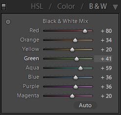
I used the HSL / Color / B&W panel on the B&W part for the cnversion to mono, but instead of it being a plan desaturation, I shifted the sliders around a little. As you can see from the original, the blue of her jeans and red of her t-shirt would make for relatively dark tones in a straight conversion. That dictated the movement of sliders to make those tones brighter.

Blues and reds were the biggest movements to brighten things up in those darker tones.

This was the image when that was done, and please note the exposure and brightness sliders are the same; playing with the tones in conversion means that we don't have to globally brighten the image to make it overall brighter and we now don't have massively clipped highlights (there's a tiny difference on recovery between the two; the mono has 10 and the original has 9)


OK, so it's beginning to look pretty bright, but there's no "glow" or ethereal feel yet. It just looks very bright and overexposed (but not clipped). Now comes the adding-glow bit, and it really is simple! It can be done in a couple of ways depending on what your image looks like and how close tot he face you are cropped. In this one, we're not tight in, so we can use a global effect; take the clarity slider and move it all the way to the left. See how it adds almost a glow? Right. Doing this on anything other than a very bright image which you want to add a glow to is very often a nasty effect. I do mean really nasty! On many bright images like this it can be nasty too, so watch what you apply this to! The other way of adding the glow is to press K to get the adjustment brush and set all sliders to 0 apart from clarity which you take all the way left to -100. Set the flow of the brush to about 25 and paint over the areas you want the glow added. Using such a low flow means you can add more of the effect by painting over again. If you want even more control, set the flow lower, but that would negate some of the speed increase you get from doing this in LR.

If you prefer to add all your effect in one go, keep the flow at 100 and apply the whole effect in one stroke. For the brave of heart and those with a little time on their hands to experiment with.

A final image (globally added glow) is below. If you dislike it, please tell me; conversely, if you like it, I'd like to know. If you try this effect effectively on your own images and are proud enough to show them, please link to them in the comments.


HTH someone,
Matt

Tuesday 6 December 2011

Split Toning Panel

Have you ever wondered why the mono prints from some people look just nicer than a plain mono conversion? Why they can have a warm feeling without being obviously toned? I came across this somewhere and have since forgotten where, so here's a thanks to some unknown author who gave me an idea for warming up the shadows which I played with and came out with a nice preset for myself.

It uses the split toning module to give a hint of warmth in the shadows and a hint of coolness in the highlights and it improves things considerably in my mono conversions. You may well have a mono conversion which just works for you every time (and I applaud this), but I like this effect for mine. Obviously, like all presets or PS actions, it doesn't work on every image and requires some tweaking for those it doesn't immediately work on.

Rather than give you a preset, I'll show you what to do to get the effect in your own copy of lightroom and you can save the preset yourself to your own preferred directory.

For testing, I recommend that you have a collection of images or virtual copies of a good variety of image types that you can play with and if they just don't work, you can either hit reset or delete the virtual copy.

Make a mono conversion in whichever way you prefer (I just hit the B&W button on the HSL / Color / B & W panel and used a straight conversion with no adjustments to the sliders for this base image). I've used the image from the previous post for this one as I just love this image in colour and mono!

Here's the image with a plain mono conversion (no adjustment to the colour sliders) for a start image and to allow them to be compared:

Open the Split Toning panel, if it isn't already open and change the highlights Hue slider to about 240 which is a nice blue tone which, when used subtly, gives a hint of coolness to the highlights. That subtlety is by having the highlight slider to a value of only 5. If you have this much higher, it will give a very blue tone and this is meant to be un-noticeable as a tone, but to just nudge the image away from being very plain mono. Once you've done this, take the shadows slider to about 40 which is a nice brown and with subtlety give a touch of warmth to your shadows. Again, we're being subtle, so keep the saturation slider to about 10.

The image with the adjustment made - if you open them both in new tabs and flick between the two, you should see the subtle differences. Barely noticeable, but it gives a much better conversion!


Hope this is of help to someone.